


By Manifestation
12/28/2008 - 05:43:59
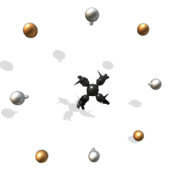
Type: Spaceship
Rating: 3.75 (Good)
Tags: alien, alternating, burn, chill, cold, energy, expansion, fire, flask, freeze, hot, ice, machinery, movement, orbs, regular, rotating, space, sparkles, square, strange, symmetrical, temperature, thermo, thermos, weird
Description
(Rearranged due to symbolic implications.)
(Pronounced Thermos Flask. XD Best viewed in editor, not viewer or png. The light effects are displayed to their full potential there.)
(Also, happy holidays everyone. =) Though I think I'm too late for Christmas. XD)
This mysterious ship design is the product of an enigmatic race of aliens that lives on a planet which was once a blooming paradise, but has, for reasons unknown, stopped orbitting around its sun. As a result, half the planet is always basking in perpetual daylight while the other freezes in an eternally dark and chilly nocturnal state, and the surface is ravaged by vicious windstorms and rendered nearly uninhabitable. This cataclysmic event has turned the surface of the planet into a barren wasteland on both poles of the planet, and the technologically-dominant sentients of this world are one of the few species to have survived by adapting to subterranean life.
In the complex laboratories located in their underground honeycomb network of sophisticated cities, the peoples of this planet have harvested the unique properties of mineral alloys from both sides of their dichotomous planet to create a ship that blends both extreme heat and cold together. The thermal fields from both ores interact both scientifically and magically to propel the craft forward through space. However, this delicate technological marvel is complex and relies on an intensely-maintained balance between the hot and cold portions of the vessel, making it a very magnificent but fragile piece of technology indeed.


By Manifestation
Really, did everyone notice the Nazi symbol except me? >_l Anyway thanks for pointing it out, I'm glad I was notified!
By CalamariM
Much better when it isn't nazi. xD
By werderfan2012
blued it =)
By werderfan2012
great design and wonderfull colors,R+
By Manifestation
Lol yeah, actually I do kind of prefer it this way... The other design was too perpendicular for my tastes... The diagonal firejets are cooler I think... XD
By Rantalia
Oh, I didn't notice that, I was too quick in edit mode. But it's not a bad decision to rearrange it this way =)
By Manifestation
Am I the only one who didn't notice? =/ Lol I'm glad its better though...
By Drubinsky
Better!
By Koil08
Had noticed that on the other one... This one is beautiful tho! Great work as usual, and good to see you producing again.